


POLIME-New digital way to live in university.
The challenge
Politecnico di Milano, in partnership with Tangity Design Studio, presented a task to update and redesign the existing application.
In working on this project, my team followed the phases in the image below. We can see the iterative nature of the project, as we aim to test each design decision with users to receive feedback at every stage of the design process.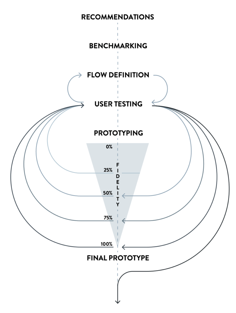
Discover
Typical user and goals
Our project strategy prioritizes the user experience, and we’ve chosen to begin with the users themselves. Our initial challenge is comprehensively understanding the university app’s user base and usage patterns. This strategic decision sets the foundation for our user-focused redesign.
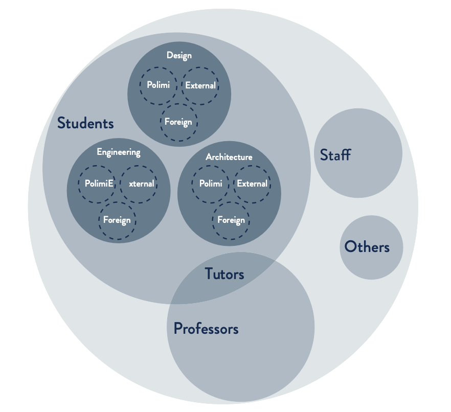
First, we identified the different groups of people using the university app, including students, professors, and tutors. Although the app is primarily associated with student use,
it is also utilized by other user groups. We then researched how and why students use the app to identify their primary objectives. 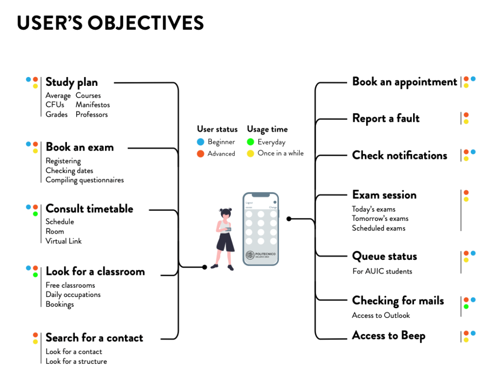
Heuristic evaluation
The first step was a meticulous analysis of the app using a heuristic evaluation.
This was done to define the main usability problems related to the architecture or user interface, test all the functions, flows, and screens available in the application, and grade each problem detected from 1 to 5.
Benchmarking was then carried out with direct competitors and apps unrelated to the university world, which stood out for their usability or were very popular among our target users.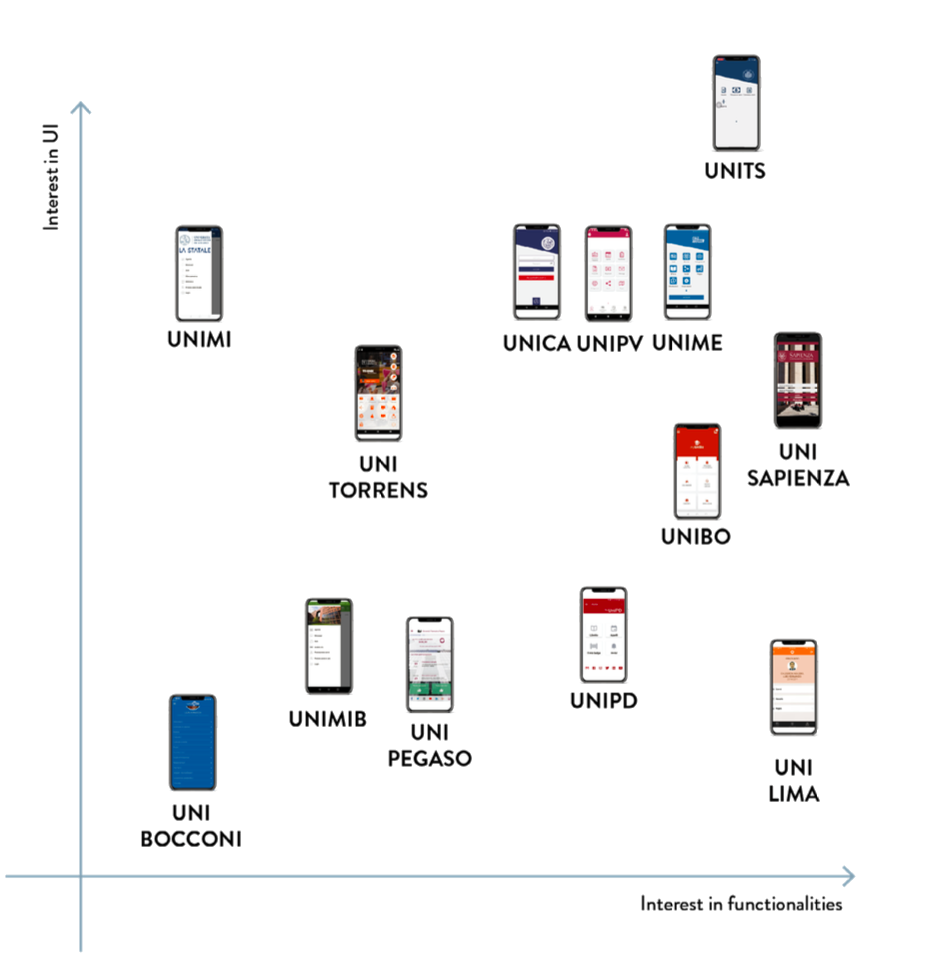
Define
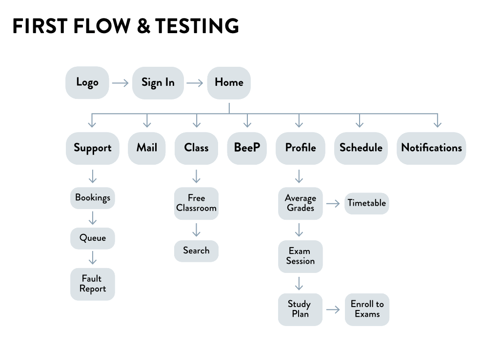
Card sorting and flow
An initial flow of the new app was created within the group. This was tested by creating a card-sorting
The card sorting provided an empty flow structure that each user had to fill in with the given keywords to show the information architecture that was most intuitive for him.
Develop
prototypes and user tests
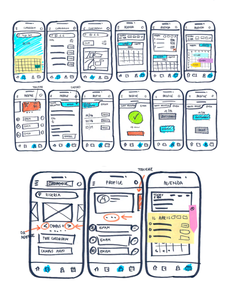
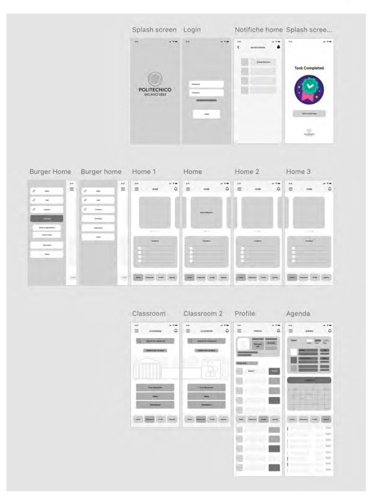
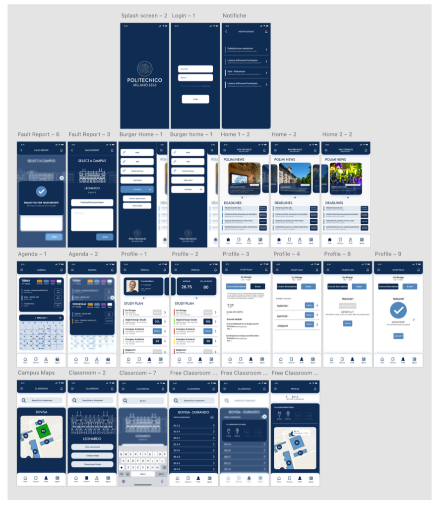
The design of the new app proposal followed a user-centered process. In fact, for any prototyping phase, we created a testing phase with users, always different, to have immediate feedback for fixing our idea. Having found a flow the users could agree on, an initial test UI was created and quickly sketched freehand. Then, a mid-fidelity prototype was developed and tested, and the final high-fidelity prototype was delivered with the feedback gained.
Delivery
The customer was handed a report recounting all the work, the working app, and this video.
PROJECT INFO:
February -April 2021 Team project
My Role: UX researcher / UX designer / Information Architect / Prototype specialist
what was my contribution to the project
As is often the case in group work, I contributed more to certain activities than others. I want to acknowledge this imbalance and assure you that I did my best to contribute at each step.
During the research phase, I took on the role of an active UX researcher. As a first-time app user, I conducted the heuristic evaluation phase, initially on my own and then by interviewing other students. Additionally, I spent considerable time collecting both qualitative and quantitative data and summarizing them. I also organized the card sorting and actively worked on defining the final flow and information architecture.
Instead of the process’s pure design phases, I helped build the device’s user experience by working on XD with a classmate and then prototyping the whole experience with the final UI in Protopie.